


Data Visualization
Universities Employing Immersive Visualization
By Kari Johnson, Special Correspondent
Although well known for its use in upstream oil and gas applications, immersive visualization is finding its way onto university campuses as an indispensable aid to research as well as an invaluable teaching tool.
With applications ranging from digital photography to molecular dynamics, exploration analysis and remote visualization, on-campus, immersive 3-D visualization laboratories are being welcomed by users ranging from industry consortiums to university maintenance departments. They also are proving their value as visual learning aids for disciplines ranging from humanities to medicine, as well as for introducing grade- and high-school students to the wonders of advanced technology.
The DAVinCI visualization wall at Rice University in Houston is helping students and faculty gain new insights into a wide range of datasets, says Erik Engquist, Rice’s visualization manager. He reports the Data Analysis and Visualization Cyber Infrastructure (DAVinCI) wall was dedicated in September 2012 and has seen a great deal of attention from researchers since. “There is a noticeable difference in data perception when users can go deep into the data and even walk around it,” he extols.
The visualization wall consists of a four-by-four array of Barco stackable projection displays measuring 14 by eight feet and totaling more than 33 million pixels. The wall presents a seamless image that can be displayed in three dimensions when viewed through special glasses, Engquist describes. Two robust servers power the wall: One has two NVIDIA quadro plex 7000 graphics cards and runs Linux, while the other has four NVIDIA quadro k5000 cards and runs Windows 7.
“By using these two servers, we are able to support the majority of applications used by our students and faculty,” reports Engquist.
He says additional computing is available over a 10 gigabyte connection to cluster resources with graphics processing unit nodes. The wall was funded as part of a National Science Foundation grant, while the laboratory and facilities were funded by a grant from Chevron.
Despite the obvious interest in the technology itself, the real focus for the visualization center is research, says Engquist, whose role is to support visualization and data analysis throughout the campus. Uses range from digital photography and architecture to molecular dynamics, fluid dynamics, and exploration analysis.
Using the wall for collaboration is a key benefit, Engquist allows. “We often have groups working with data, interacting and sharing insights,” he says. “It is a great teaching tool and very effective for communicating findings.”
This collaboration has proved fruitful for oil industry consortiums. “Faculty and external collaborators meet in the visualization lab to review data,” he reveals, saying domain experts can communicate very effectively in this environment.
DAVinCI Wall
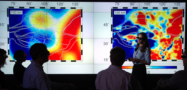
Rice University’s DAVinCI (Data Analysis and Visualization Cyber Infrastructure) wall enables users to gain new insights into a range of datasets. The visualization wall consists of a four-by-four array of Barco stackable projection displays measuring 14 by eight feet and totaling more than 33 million pixels. It presents a seamless image that can be displayed in three dimensions when viewed through special glasses.
High Performance, Low Effort
The DAVinCI wall and infrastructure support software used elsewhere on campus as well. “If it runs on a regular workstation, it can run here,” says Engquist, adding this removes a substantial barrier for potential users.
Often, little or no setup is required if the software is already on the cluster. Otherwise, software may need to be loaded, but no special configuration is needed to run it on the system, Engquist says.
When a new research project is proposed, he says the visualization team holds an advance meeting with the researchers to ensure all is working as expected. “A little preparation goes a long way in successful first use of this tool,” he comments.
Visualization is tightly coupled to the cluster to yield the best performance, Engquist says. The cluster itself is used throughout the campus for workstation-based analysis, simulation and similar computational work. He says Rice University also supports remote visualization using the cluster. Data stay in the center, while remote users view the visual representation. Specialty software presents the visualization data on the user end.
Visualization technology opens possibilities for virtually any data, Engquist maintains. When designing the space, he says the team chose to leave it flexible. It is populated with modular tables and chairs so it can be configured appropriately for each use. It even has been emptied for an art exhibition presented on the DAVinCI wall.
Engquist notes that departments beyond the sciences have used the space successfully. He says the humanities department, for example, has huge maps from prior centuries that have been digitized and displayed on the visualization wall. “Students interact with the maps like they do with Google Earth,” he comments. “It is a much more interactive approach and one that enables deeper understanding.”
Another team from the earth sciences department used the DAVinCI wall to interrogate data from a rock formation in West Texas, Engquist mentions. “The team used drones to collect the data at a very fine level, imported them into Google Earth, and can zoom into any point of interest,” he outlines. “The team can collaborate in its formation analysis in a way that offers more opportunities for fresh insight.”
Where No Data Have Gone Before
While visualization technology can a beautiful communication tool, there is so much more benefit and value to be had, asserts Emma-Jane Alexander, visualization manager for the Shell 3-D Visualization Center at the University of Wyoming in Laramie. “We help users visualize and interact with their data in ways they never have before,” she states.
The lab was established with three core elements: a 10 square-foot, four-walled cave, a two-by-three array 3-D video wall, and a three-screen, portable 3-D minicave. The cave is ideal for a one-person, truly immersive experience, Alexander characterizes. She says the minicave provides a semi-immersive experience in a much smaller space, while the wall is great for small group collaboration.
A staff of three full-time employees operate the Visualization Center: Josh Clark (Mechdyne Corporation service engineer) maintains the visualization hardware; Nikhil Shetty (data visualization specialist) provides technical bespoke programming and software support, and Alexander is responsible for managing the facility, ensuring it can operate in a flexible manner to meet the needs of its users, create opportunities where possible, and exploit diverse capabilities for the benefit of teaching/research at the Institution, she says.
In addition, Alexander continues, four interns conduct demonstrations for visitors, load data, and work on a variety of projects. “Our interns are working on a virtual model of the university, which is a campuswide, multistakeholder project,” she mentions.
Alexander says the model will provide value to many users. Facilities engineers will be able to walk through maintenance procedures using the model, reducing the impact and duration of actual maintenance. She says the university’s architecture department will be able to add new buildings to the model to ensure a good fit with the campus before finalizing designs.
Ideally, Alexander says, data and associated applications are plug-and-play. For example, users who require 3-D seismic interpretation of their data utilize the software Petrel in the cave. She adds that conduit is used as middleware, which allows for the redistribution of the graphics commands from a desktop application to an immersive display.
Experience A Virtual Environment
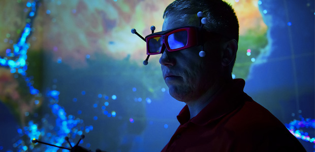
VIZ CENTER
A “head-tracked” user explores an earthquake dataset, interacting with a hand-held wand, at the Shell 3-D Visualization Center at the University of Wyoming in Laramie. UW’s “Viz Center” features a 10 square-foot, four-walled cave, a two-by-three array 3-D video wall, and a three-screen, portable 3-D minicave.
Most recently, Alexander comments, Nick Jones, a senior geologist in the Enhanced Oil Recovery Institute at the School of Energy Resources, has utilized the cave to bring together various datasets for analysis with regard to visualizing oil and gas development in Wyoming. The project has focused on developing structure contours of key geologic formations for all of Wyoming’s major basins.
Jones says, “Being able to stand inside and experience a 3-D virtual environment of subsurface data of this magnitude has been extremely beneficial to the project–not simply as a communication tool, but for inviting a new kind of analysis that permits me to visually collate the data in the cave and then experience it in a new way. I can physically walk around the 3-D virtual subsurface data to perform my analysis. This is much more natural and conducive to research than bringing my head closer to my computer screen and moving a mouse around on the desktop to navigate a dataset that is many tens of miles wide.”
Alexander says another compelling case of how using the 3-D cave has leveraged faster scientific analysis is using it to support the visualization of a modeled-pore network from rock samples found in reservoirs. She says UW scientists extracted pore network geometry from the rock samples where these 3-D structures can be extremely complex.
Visualizing them on a traditional two-dimensional display for correctness and debugging is almost impossible, she reflects. One needs to be immersed in the data to understand them. Alexander says using the 3-D cave supports collaborative debugging by placing a group of experts in the immersive virtual environment with their data, where they are able to analyze the data immediately with a greater level of integrity to enhance their understanding of features, requirements, and the nondesirable features of the code.
“We have worked with the UW College of Engineering and Applied Science to support STEM (science, technology, engineering and mathematics) professional development for teachers in the state of Wyoming,” Alexander goes on. “We worked with the data taken from the drones they fly around campus, and from this work with the geometry to create 3-D models. The teachers then can walk around their models in the 3-D cave and consider how they can utilize such technology in the classroom.”
Alexander says the ultimate goal is to make it easy for users to pull apart their data, question their findings, and gain new insights. Sometimes the sheer scale of display and resolution is sufficient to provide new insight, but more often insight comes from providing a collaborative virtual environment that allows for a multitude of data to be brought together like never before. “Users new to the technology swiftly adapt to it, then begin to relax, play, and explore their data to search for new meaning” she remarks.
There typically is a bit of adjustment for first-timers in the cave, Alexander notes. Users are given a hand-held wand to interact with the data through motion tracking. “They usually ride the excitement for about 10 minutes,” she notes. “Then they turn back to their data and focus; everything else becomes just a collection of tools, which is exactly as it should be.”
Multiple Missions
The mission for the Shell 3-D Visualization Center is to support teaching, learning and research at the university, Alexander says. When particularly challenging teaching concepts are presented, it often is beneficial to use a variety of visualization techniques, she attests. For example, she says, the WWAMI (Washington, Wyoming, Alaska, Montana and Idaho) Medical Education Program used the cave to enhance its teaching of anatomy.
iPad-controlled data displayed inside the 3-D cave were compelling for students to interact with, and discuss and debate, Alexander attests. And she says the bonus of being able to use an iPad gave the users immediate confidence because they already were very familiar with the interaction device.
Faculty from UW’s Department of Molecular Biology have used the laboratory for molecular analysis, creating a variety of technology orientated installations for classroom work related to protein analysis, Alexander continues. She says more than 50 students utilized the 3-D cave, the minicave, the tile displays and touchscreen to explore their material.
Feedback from students directly noted how it aided their understanding, and the faculty member delivering the session commented that students were able to more quickly grasp the teaching concepts required, Alexander reveals, adding that she and her team are big advocates of open source data and applications. She says this teaching session in particular utilized VMD, which is a molecular visualization application for analyzing large biomolecular datasets.
Alexander says that when supporting research activity within the visualization center, faculty and students use the technology to communicate their research as well as to speed research and to gain new insights. “Ideally, I would very much like our ‘Viz Center’ to contribute to key scientific (or other) discoveries,” she says.
The Viz Center also introduces school groups to visualization. “We work with schools to show our future workforce what is possible through combining programming, visualization and data from any discipline,” Alexander describes. “It helps them understand traditional data display and the potential for visualization to help address key energy challenges. The center also is available to assist industry with such projects as virtual prototyping and environment familiarization.”
Someday soon, Alexander says, she hopes to design and deliver a portable “on-the-road” version of the visualization center. This would allow UW to further enhance its community engagement: taking key aspects of potentially energy-oriented research and creating interactive immersive visualizations of the content.
The on-the-road Viz Center could spend dedicated time with schools, and be available for use by private firms for immersive training of hazardous working environments and situational awareness, for example, she suggests. “School children could utilize the freeware SketchUp to create creative 3-D sculptures and then bring their own data into the portable Viz Center for viewing and interaction,” she illustrates.
“We are most keen to develop our ability to support the visualization and analysis of big data. We have a variety of users who are facing this challenge, and we feel well placed to support them,” Alexander concludes. “The excitement generated by visualization technology is immense. Our role here in the Viz Center is to ensure that excitement is translated into actual positive impact for the institution with regards to improving teaching, learning and research.”
For other great articles about exploration, drilling, completions and production, subscribe to The American Oil & Gas Reporter and bookmark www.aogr.com.